Common Board Book Printing Mistakes First-Time Authors Make
Get your board book print-ready with proven tips for formatting, artwork, and layout.
Is there anything better than finishing your children’s book? You’ve spent months, maybe even years, perfecting every word, working with your illustrator, and dreaming about the day tiny hands finally hold your creation. It’s a wonderful feeling!
Publishing your first board book is exciting, and we want that excitement to last all the way to the final printed copy. Yet many first-time authors are disappointed when they spot issues like hard-to-read text, low-resolution artwork, or important content positioned too close to the hinge area of a spread. To help you avoid those common pitfalls, we've gathered the file-preparation mistakes we see most often and how to prevent them.
Think of this guide as a friendly heads-up from your printing partner, so your first proof copy makes you smile, not sigh.
First Things First: Formatting Matters
As with any offset printing project, the way your book is designed directly impacts readability and how content appears across each spread. Small formatting mistakes made early in the process can lead to bigger issues down the line.
That’s why, if you are not experienced in preparing files for print, we recommend involving a graphic designer or professional book formatter early in the design process. This small upfront investment can help ensure a polished, professional-looking book and improve its appeal to potential readers.
Let’s explore some of the most common book design pitfalls and how to avoid them with ease.
#1 The “Novel” Trap (Too Much Text)
One of the most frequent hurdles for first-time authors is trying to say too much on a single page. Board books are designed for babies, toddlers, and preschoolers who respond best to rhythmic cadence, repetition, simple core concepts, and bright, engaging visuals.
Here's a quick example. This sentence might shine in a picture book: "The little yellow duck waddled slowly across the soft green grass, looking carefully behind the tall flowers for her favorite shiny red ball."
For a board book? Try simply: "Where is Duck's ball?" Now your illustration does the storytelling, and your little reader gets the joy of spotting the ball themselves!
How to Nail It:
- The 100-Word Rule: Aim for 0 to 100 words total for the entire book.
- One Concept per Page: If your text says "the bunny hopped," let the picture show the hop.
- Ruthless Edit: Your artwork should carry about 70% of the storytelling. Ask yourself: Can this be shorter? Will a toddler get it instantly? Will a parent enjoy reading it for the hundredth time?
#2 The Readability Fail (Tiny Fonts)
Because board books are read in all kinds of cozy conditions by grandparents, tired parents, and early readers alike, the type needs to be effortlessly clear at a glance. A size that looks fine on a bright monitor can feel surprisingly small once scaled down to a compact board book.
How to Nail It:
- Go Big and Bold: Keep your font size to an 18 pt. to 24 pt. minimum to make it more accessible and engaging.
- Prioritize High Contrast: Avoid dark text on dark, busy artwork. Use white text or a soft color block behind your words.
- Choose Clean Typefaces: Stick with simple, readable sans-serif or bold serif typefaces, and skip thin or fancy script styles.
Need more detailed file setup and printing specifications?
#3 The Pixelated Surprise (Low-Resolution Art)
This is a technical step that frequently goes unnoticed until files are ready for manufacturing. As with any offset-printed book, your illustrations might look bright and sharp on a screen, but may not produce the same result on paper.
That's because screens use RGB (Red, Green, Blue) colors, while commercial printers use CMYK (Cyan, Magenta, Yellow, and Black) inks, which can cause some colors to appear slightly different when printed.
Similarly, images saved from websites are optimized at 72 DPI (Dots Per Inch) to load quickly online, which is too low for the crisp standards of high-quality printing.
How to Nail It:
- Check Your Resolution: Every image should be 300 DPI at the actual print size. If your book is 6"x6", your images need to be 300 DPI at exactly that size (no stretching!).
- Design in CMYK: Set your files to CMYK before illustration begins to get a more accurate preview of printed colors and avoid surprises later.
- Utilize Vector Graphics: Create text, logos, and graphic elements as vectors so they stay crisp and scalable without losing quality.
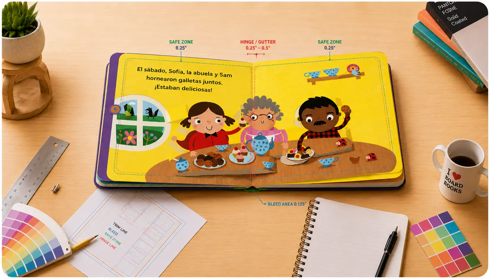
#4 The Safe Zone Slip-up: Margins, Hinges & Safe Zones
This is the most technical one on our list and the one we most want to save you from!
As with all offset printing, the proper use of bleed and safe zones is essential to ensure your artwork and text print correctly. With board books, the hinge or gutter area at the center of each spread is often more pronounced than in standard paperback or hardcover books because of the thickness of the board material and the way the pages are assembled.
While board book spreads lie completely flat and no content is lost in the center, it's best to avoid placing critical text or detailed artwork directly over the hinge area, as the slight elevation can make those elements appear slightly skewed. Likewise, content positioned too close to the outer edges may sit uncomfortably close to the final trim line.
How to Nail It:
- The Bleed Zone (0.125"): Extend background art 1/8 inch beyond the trim line to prevent unwanted white edges after trimming
- The Hinge Area (0.25" – 0.5"): Avoid placing important text, faces, or key design details directly over the hinge area of a spread
- The Outer Safe Zone (0.25"): Keep all text pulled back at least a quarter-inch away from the top, bottom, and outside edges.
#5 Understanding Page Counts
Board books are designed and manufactured in spreads, with the inside page count beginning on the inside front cover and ending on the inside back cover. Because each spread consists of two facing pages, the total page count must be divisible by two.
We recommend including between 12 and 32 pages in a board book, though other page counts are possible depending on your project. Before finalizing your files, it’s a good idea to confirm the page count with your printer so they can provide the correct template and spine width for your book.
How to Nail It:
- Confirm Before Cover Setup: Once your final page count is chosen, confirm it with your printer so they can provide the correct cover template and spine width.
- Design Backward: Build your story to fit your chosen count.
- All pages, even blank ones, should be included in your page count.
Bonus Tip: Little Readers, Big Safety!
Babies explore the world with their mouths. They will taste-test your book! That's why quality board books are made with non-toxic, soy-based inks, water-based coatings, and safety-certified materials (like CPSIA compliance in the US). And always go for rounded corners. They're gentler on little faces and far more durable over time.
Checklist: Before You Hit “Print”
- Word count under 100, one concept per page?
- Font 18pt or larger with strong contrast?
- All images 300 DPI at true size?
- Files converted to CMYK?
- Text pulled back from edges and hinge area, with proper bleed?
We Are Here to Help!
You don't have to know it all. If you are new to printing, we can recommend designers/book formatters to help you prepare your board book files.
Your story is special, so we want your book to reflect the quality of your story and illustrations. By following our guidelines above, you can produce a premium-quality board book that readers and bookstores love.
Ready to start printing? Get an Instant Quote or Book a Call with our Board Book Printing Specialist.